The Wallace Collection App
Table of Contents
6. Individual Items Detail Screen
7. The Search Process and Screens
9. The User Notes Functionality
10. Downloading Full Collection
Appendix A - Technical Information
The Wallace Collection app is an educational app design to assist the user in appreciating and understanding the Wallace Collection at Hertford House. It contains no advertisements.
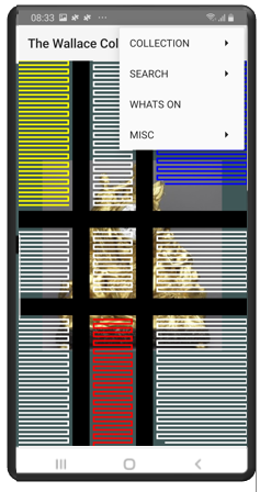
The Wallace Collection app will display an introductory screen when the app is initially loaded.
This screen will include an image showing one of the collection highlights. It will also display a menu icon in the top right hand corner that allows the user to continue to the Manchester House Ground Floor Plan Screen. This is the second screen and it displays a plan of the ground floor of Manchester House.
This can be accessed through the “Collection” menu entry shown on the left.
From the initial Collection plan one can then move to other screen plans effectively drilling down. Moving through the “Collection” menu item is one of the apps core paths.
Other paths will be described later in the documentation.
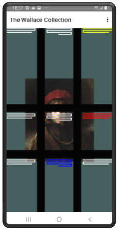
The introductory screen shows four of the Collection Highlights. These are as follows:-
- The Laughing Cavalier by Frans Hals
- The Avignon Clock by Pierre Gouthiere
- Titus the Artists Son by Rembrandt
- Armour of Sir Thomas Sackville
The image of the Collection highlight is part of a digital artwork. Once the collection highlight has been displayed an abstract display in the style of Piet Mondrian will be dynamically created. This will consist of horizontal and vertical lines in black with the rectangles being created in the primary colours of red, blue and yellow. The display is dynamically created.
An example of the screen is shown on the right.
The Mondrian style introductory screen display is the default display. It is the first of eight screen displays. To access the other seven, enter the main menu in the top right corner and press the Screen Type option. This will result in all eight screen types being shown as in the screen display on the right. Selecting one of the alternative displays will cause that introductory screen to be displayed.
To move on touch the main menu icon found in the top right hand corner and then touch the “Collection” option. This will open the Manchester House ground floor Plan screen which is detailed in the following section.
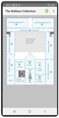
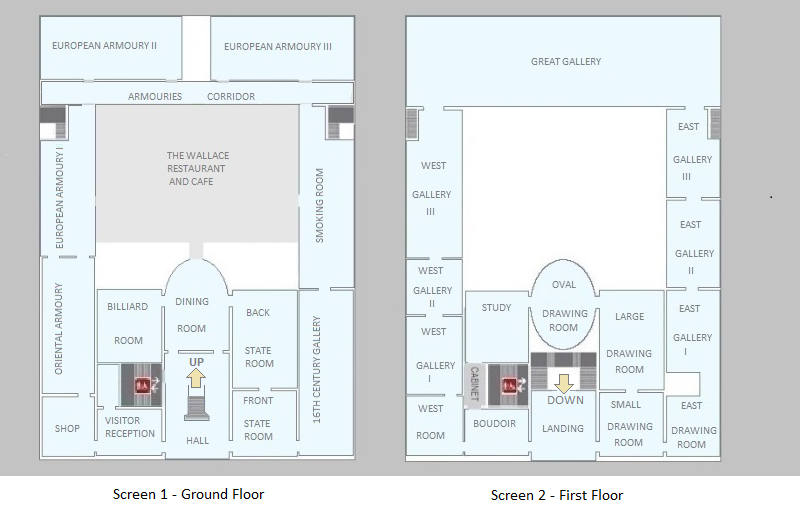
The Manchester House plan consists of two screen displays, the ground floor and first floor of Manchester House. The screen allows the user to move to a specific gallery. The full map of the two floors is shown below. To move to the first floor touch the blue dot next to the arrow with the associated text of “UP”. This is located in the Hall.
To obtain the specific part of the map required move the screen by touching the screen with one's finger and then moving your finger up, down, right or left until the section of the map that you require is displayed.
To move to the specific gallery touch the dark blue dot associated with the specific gallery and the gallery screen will be displayed.
In addition a menu icon is displayed in the top right of the screen which when touched will result in a full list of menu entries appearing. This allows the user to move back to the Home screen, the “Introductory Screen”.
The Gallery plan screen can display each of the individual gallery's.
The display below is an example. The West Gallery I is shown in the display screen below.

As can be seen the screen is divided into two sections. In the top middle section is the idealised mapping of the specific gallery. The bottom section of the section displays a swipe section displaying the individual collection items. It displays two/three items at a time but by placing ones finger on the swipe area and moving your finger to the left or right additional collection items will slide into view.
In the main map section the touching of the collection item icon will result in the Individual “Item Screen” being displayed. This will be covered in the following section. The map can be moved by touching the screen with one’s finger and moving the finger so that the part of the map currently hidden is therefore displayed. This is useful in the gallery’s that cannot be fully displayed in the window as for example the Great Gallery.
In the “Swipe Screen” section the touching of a collection item will result in that item being selected and displayed in purple in the Gallery Map section. Touching the collection item for a long touch will result in that item being displayed.
The Gallery Plan screen will in addition have a menu icon in the top right corner. This will display a list of menu items when touched.
6. Individual Items Detail Screens
This is a collection of screens linked by a page slider.
The screens will be made up of the following:-
- 1. Exhibit display and exhibit facts.
- 2. Exhibit description
- 3. Artist description
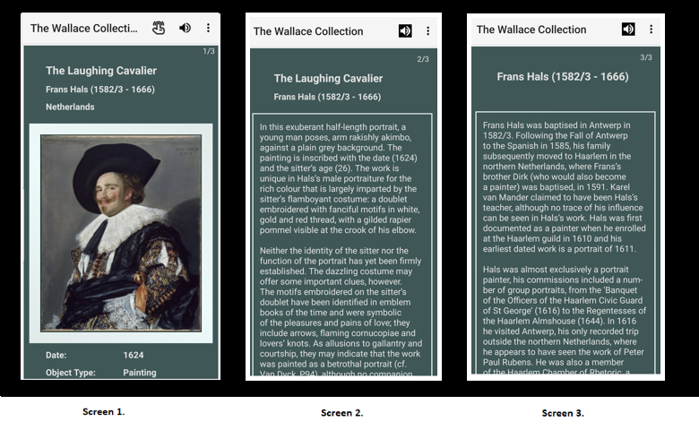
Each of the above will be displayed on its own page and the user will be able to move between the pages by use of a page slider. An example of the detail screen is shown above.
Generally there are three screens but it is not always the case.Where there is no artist description, when for example the artist is unknown, then no artist page is displayed. In some instances there is no item description. Every item though will have a page one giving the item description and statistics. In the example above the statistics are not currently in the display window. Placing your finger on the window and moving it up will result in the window display moving upwards and the statistics coming into view.
In this screen display the page back option is very useful returning the user to the original gallery map screen.
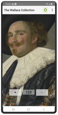
In addition to the three possible screens shown above there is in most instances an enlarged image screen as shown on the right. This consists of the image shown on page 1 above but with a higher resolution. This enables the image to be enhanced. To increase the size of the image press the plus button repeatedly till you reach the size you are looking for. Pressing the minus button reverses this process.
The image can be moved to bring specific parts of the image on screen when the image has been enlarged. This is done by putting your finger on the screen and moving the image right, left up or down.
To display the enlarged image screen touch the image display or alternatively touch the finger icon at the top of the screen. If the finger icon is not displayed this indicates that there is no high resolution image available.
7. The Search Process and Screens
The search options allow the user to find specific collection items or groups of items. The user can search on either the artist or the collection id.
To start a search on the artist select the Search option from the main menu from any screen and then select the search artist option. The screen shown below as Screen 1 will then be displayed. This option searches on the artist. Enter the first character of the artist. In the example above the C button was pressed resulting in all the artists who start with the letter C. Then the Canaletto option button was pressed.

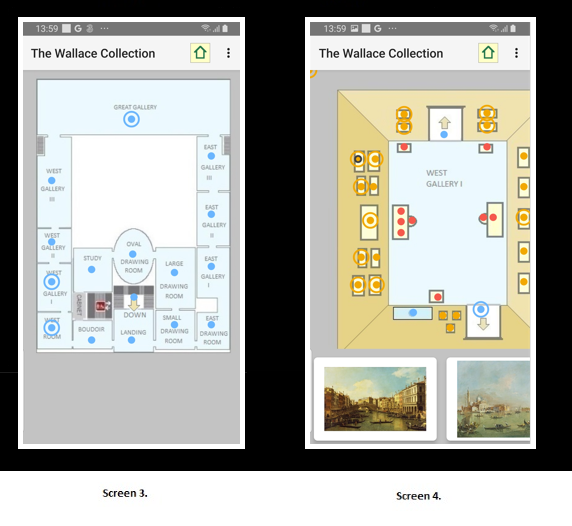
If you now return to the main map screen you will see that three of the galleries have an additional blue circle outside of the blue dot icon. This signifies that this gallery contains search collection items. This is shown below in Screen 3. Drilling down to West Gallery I you can see the specific pictures identified as by Canaletto by the orange circle. This is shown in Screen 4 below. Not all of the entries are definitively by Canaletto; some you will notice are identified as “Studio of Canaletto”.
To clear the current search selection, go to the menu, then Search and finally press the Clear menu option. This is the only method of removing the current search selection. Selecting a new artist sets this artist works in addition to any existing selected works.
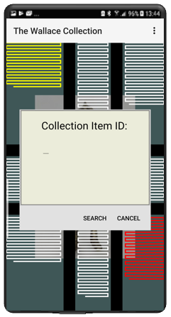
The second search option introduced in Version 1.17.0 is to search on ID. From the main menu select the search option and then select the search id option. The screen shown above will be displayed. Enter the collection id of the item you are searching for. Entries when found will be displayed with an additional outer circle and the gallery that contains the item will be displayed with an additional blue circle in the same manner as searches on artist.
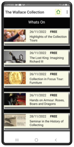
The “What’s On” screen is the third path. This path is not centered around the Collection but round forthcoming events.
The main events screen is shown on the right. The user can scroll up or down. The entries are listed in date order with the earliest events at the top and going down the screen with the last events being at the bottom.
To obtain more information with respect to a specific event touch the entry in the list and the screens shown below will be displayed. There are up to three screens with the first being the details, the second being the date and times and the third being the ticket information. Like the collection item screen, touch the screen with your finger and move to the left or right to flip from one screen to another.
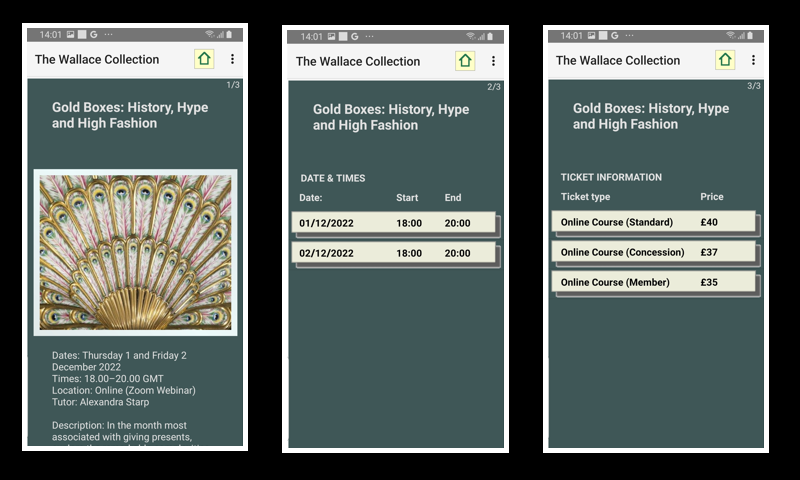
It should be noted that there are many events where there is no third screen and this is due to the event being free and therefore there is no ticket information.
The “What’s On” page can be updated by going to the Misc. menu item and then pressing “Update Whats On” menu item. This will pull the most recent events file from the server and update, insert or delete the entries. The app checks the server when the home screen is run to check if there are updates to the “Whats On” screen. If there are then a notification is sent to you. It does not update itself rather it informs you that an update is required. The notification will only be sent once per day.
9. The User Notes Functionality
In version 15 the functionality of User Notes has been introduced. This allows the user to enter notes against individual items in the collection.

There are two aspects to this new functionality. The first is the individual notes that are aligned with the collection items and the second aspect is the backup and restore of the User Notes which has to be carried out at the top level, functionality that operates on all of the User Notes.
The description of the functionality at the individual collection item level will be handled first. The screen images above illustrate the functionality at the individual collection item.
To enter User Notes against an individual collection item move to the specific item and press the menu icon in the top right hand corner. Pressing the User Notes entry will result in the screen display as shown above in Screen 1. Pressing the Add User Notes option will result in the display of an input screen overlaying the collection item screen as shown in Screen 2. Entering the input and pressing the return button will result in the input of the User Notes.
Now in Screen 3 above we can see the result of the User Notes input where the User Notes is displayed at the bottom of the Collection item screen. Above the User Item is the highlight on/off button. Moving the button to the right results in the button being switched to on. The default position is off. When this occurs the icon on the mapping screen will display an outer ring in black. This can be seen in Screen 4 above. It might be the case that having entered User Notes against an item you would like to draw attention to the fact that this item has User Notes and do so by setting the highlight to on. The highlight button though is independent of the User Notes and can be set to on whether the user has entered User Notes or not.
Once User Notes have been entered against a Collection Item it is possible for the user to either edit the User Notes or to delete the User Notes. Both options are available by pressing the User Notes option on the menu and then pressing Edit User Notes or Drop User Notes.
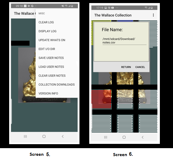
With regard to the second aspect of the User Notes, the backup and restore options, these are centered around the Misc. menu options. From the Home screen open the menu and then enter the sub menu Misc option, the screen shown above in the diagram Screen 5 is displayed. This has the three options for the backup, clear down and recovery of the User Notes. These three options are as follows :-
- 1. Save User Notes.
- 2. Load User Notes
- 3. Clear User Notes
The first option when pressed will result in the text created in User Notes being saved to a flat file. This file can then be backed up in the normal manner that applies to all your files. The second option when pressed will result in the data in the flat file being loaded into the app. It will also set the highlight to on. It does not clear down any entries so the data loaded will be loaded in addition to any data already existing within the app. If you want to clear down the existing data before loading new data then press the third option prior to loading the data.
The location of the flat file and its file name are given by selecting the Misc menu entry and then pressing the Edit I/O Dir. This will result in a screen display as shown in the diagram Screen 6 shown above. The backup file name can be edited and on pressing the save key the updated entry will be saved. It is possible to have multiple backup files each with a different name or in a different directory and each containing different User Notes.
After pressing either of the three User Notes options it is useful to check the Log File to ascertain that the function has been carried out succesfully.
10. Downloading Full Collection
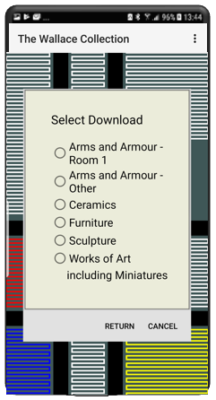
When the Wallace Collection app is downloaded and run for the first time the app comes with all of the paintings of the collection loaded. All the remaining collection items have to be manually loaded. This is carried out by entering the "Misc" menu entry and then the "Collection Downloads" entry. The screen as shown on the left will then be displayed.
Pressing one of the six buttons and then the Return button will result in the Collection items for that entry to be downloaded from the server and stored within the mobile device. Once the download has completed a status message will be found in the log detailing the number of Collection items downloaded and any download errors.
The aim of changing the functionality of the app so that the user manually loads many of the Collection items is to allow the user to manage the memory on their mobile device. Below is a table that shows the cumulative size in MB for each entry. As can be seen the memory requirements for the non core Collection items is not trivial. It might be the case that some users do not have the spare memory to hold the full Collection and if so then this option will meet their requirements.
| Title | Entries | Total Size |
|---|---|---|
| Base Load | 110 MB | |
| Armour Room 1 | 354 | 120 MB |
| Armour Other Rooms | 1149 | 183 MB |
| Ceramics | 219 | 197 MB |
| Furniture | 157 | 208 MB |
| Sculpture | 175 | 218 MB |
| Works of Art | 386 | 243 MB |
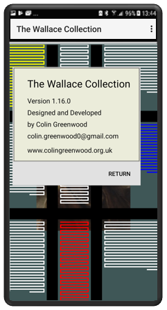
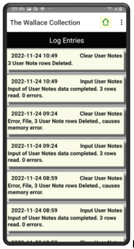
From the menu there will be additional screens of a log screen and a version dialog. The version dialog shown on the left will display the current version number plus my name and my e-mail address should you wish to contact me.
The log screen will display errors and useful information which might include warnings. It should be the first place to look when unexpected issues arise within the app. There will be an additional menu entry that will clear the log entries. Changes to the data are recorded in the log file.
The log entries can be cleared down by pressing the main menu, then the misc. entry and then the Clear Log entry. This is an event that should not be required often.
Appendix A - Technical Information
The Wallace Collection app has been developed in Android Java and requires a minimum of Android api of 22. This is Android 5.1, Lollipop.